Intro to Plotting
We can create a variety of visualizations using plot(). plot() is a base R function for creating plots. Later in the course, we will focus heavily on visualization with ggplot2, however, using base R plots is still useful in making simple graphs!
plot() has a variety of arguments we can use:
x – the x-axis variable (independent variable)
y – the y-axis variable (optional; dependent variable)
xlab – the label on the x-axis
ylab – the label on the y-axis
main – the title of the plot
There are quite a few more that can be found in the help text for plot! (?plot)
Let’s load in a simple data frame we want to make a plot of. It contains 2 numeric data (mass_g and length_cm) and a character data (species)
df <- data.frame(mass_g = c(10,20,10,15,10,10,15,20,11,10,12,11),
                 length_cm = c(11,12,15,12,11,13,14,15,11,13,12,13),
                 species = c("Species_A", "Species_A","Species_A","Species_A","Species_B","Species_B","Species_B","Species_B",
                 "Species_C","Species_C","Species_C", "Species_C"))
Scatter plot
Let’s make a simple scatter plot of length and mass. Scatter plots assume that both x and y are numeric data. We assume mass is dependent on length, thus length goes on the x-axis.
Note: To access data within a data frame, we use the $ next to the name of the object. This is covered in more detail in Section 2.
plot(x = df$length_cm, y = df$mass_g)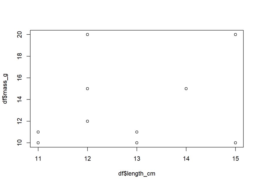
Simple! Let’s now add in the title, x-axis label, and y-axis label, using the arguments we mentioned.
plot(x = df$length_cm, y = df$mass_g,
     xlab = "Length (cm)", ylab = "Mass (g)",
     main = "Relationship of Length and Mass")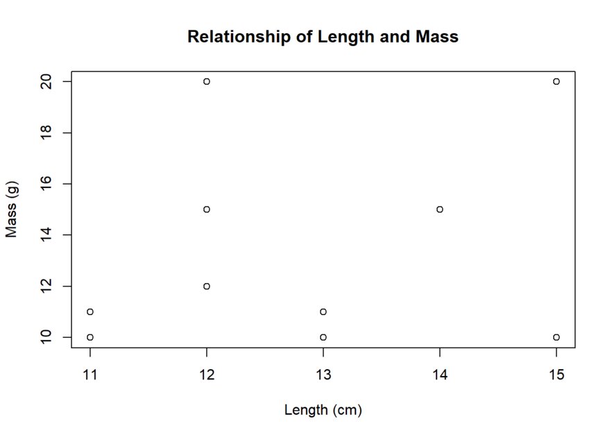
As a reminder, each argument needs to be separated by a comma and all arguments need to be within the parentheses.
Box plot
We create box plots when we have character and numeric data. Let’s create one for the variables mass_g and species!
To do so, we use the boxplot() function. boxplot() uses similar arguments as plot(), the only difference is that the data input uses a format of y~x. y is still our dependent variable, while x is our independent variable.
boxplot(df$mass_g ~ df$species)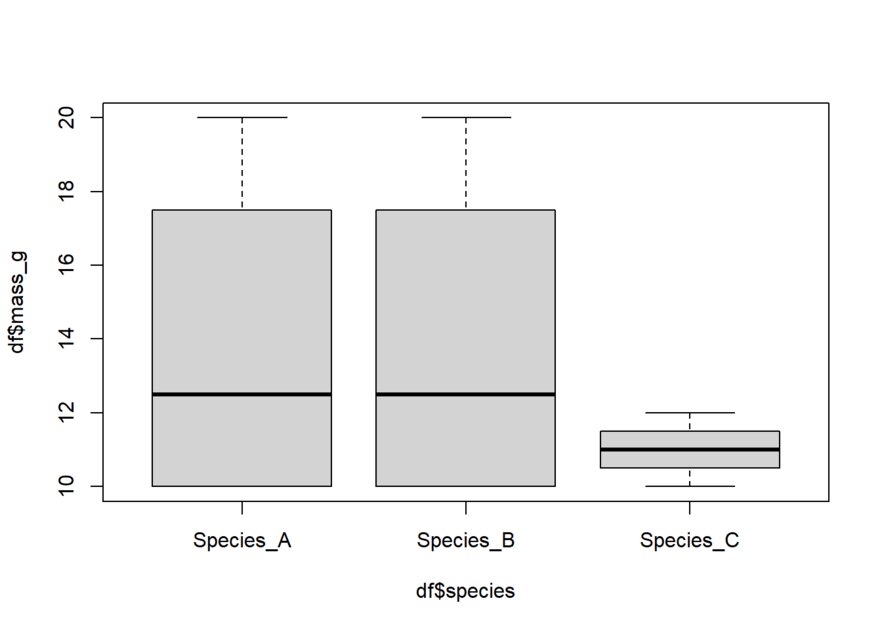
As mentioned earlier, we can specify our labels and title using the same arguments as plot(). Let’s add those now.
boxplot(df$mass_g ~ df$species, main = "Masses of different species",
        xlab = "Species", ylab= "Mass in grams")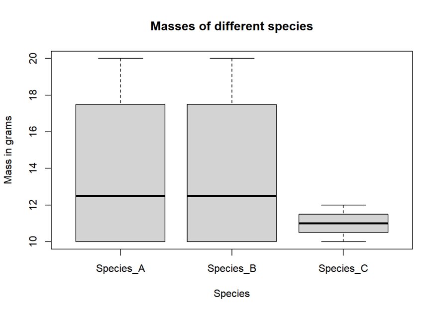
This has been just a brief introduction to plots! Once you want to start making more complex plots, I highly recommend learning the ggplot2 package.